Soul Link

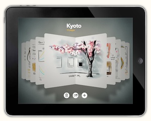
Apple AppStore’s biggest news this week is that, FiftyThree’s Paper became the iPad App of the Week in just 2 days. I think that it’s far from coincidence.
I tried Paper for several hours. It offers no unique features. It’s much less powerful than AutoDesk’s SketchBook Pro, a full-featured paint tool especially designed for the new iPad’s Retina Display which was showed off on Apple’s event. But I can predict that Paper will be much more popular. So why is it so special?
Watch their official trailer and you can get some clues. The trailer spreads several important ideas: 1. Paper can be used anytime anywhere whenever people want to use pen and paper. 2. The User, the iPad, Paper and the stylus work together as a whole. 3. All these are all about the user’s lifestyle, becoming part to it.

So what do you think while watching the video? Desire to light up your iPad at once and sketch something? Think about buying one Wacom Stylus for your iPad? Or those amazing ads for the original iPad? My answer is: all of them. And one more thing person, Don Draper.
In Mad Men’s season I finale, The Wheel, people from Eastman Kodak brought their new invention, a slide projector to Don Draper for a name and an ad campaign proposal. After a typical Don’s inspiration routine Don Draper dug up a vision from his childhood and proposed ‘Carousel’ as the name of the projector, which made it a symbolic memento of everybody’s childhood. Don Drape explained this idea as below:
“Technology is a glittering lure. But there’s the rare occasion when the public can be engaged on a level beyond flash, if they have a sentimental bond with the product.”
– Don Draper, Mad Men Season I Episode 13 “The Wheel”
Functional features are the essence of a product. But most product features are not so specific nor unique for the users. Thus they cannot differentiate your product from similar ones (either from you or your competitors). You’d find a way to lure the users to use it, and you have to guide your users to the perfect moment to use it. Under specific scenarios or circumstances some of your design will make your product unique, any design that plants the strong idea into people’s mind, that your product is made just for them and for THAT moment. Finally users will become to depend on your product at such moments. That’s the sentimental bond as Don told us, and the soul link between product and people.
There is a popular fallacious point among product guys, thinking that the well polished UI is the soul of product, which can make people be deeply touched. It’s WRONG. People may be touched, but that’s not your product’s purpose and people won’t love products just because they are touching. Try ask yourself:
After showing off your product to someone, can they intuitively understand what purpose and moments the product for, then remember your product and desire to have a try ASAP the right moment comes?


If not, they won’t be bonded to your product. Go get someone else or re-think your product and find the soul link. Seal the link on each of every steps which give birth to your product: designing, building, integrating, presenting and promoting.
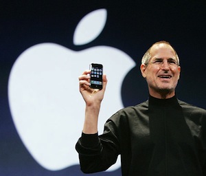
It’s really simple rule. But in the history of technology very few people can make it. Steve Jobs is one perfect example and he had made Apple an organization talented to make products that way. I think that people in FiftyThree also have such talents. Paper not only has strong soul link to people, but also to the iPad, Jobs’ most favorite creation. I’m pretty sure that if Jobs were still alive, he would certainly love Paper and its creators, and invite them to join Apple.